Biktarvy patient information booklet
CLIENT
Gilead Sciences
2021
In 2021, I was commissioned by Gilead Sciences to develop a patient-focused resource for Biktarvy, an HIV antiretroviral medication. Recognising that standard Consumer Medicine Information (CMI) documents are often clinically dense and intimidating, our goal was to create an engaging, accessible companion that translated vital medical data into a user-friendly format. Designed with the user's daily life in mind, the final product was a small, discreet A5 printed booklet.
A Community-Led Design Process
To ensure the resource truly resonated with those it intended to serve, the project was guided by the MIPA principles (Meaningful Involvement of People with HIV/AIDS). This consensus-driven approach involved:
The project team worked directly with people living with HIV to ensure the content addressed real-world concerns and questions, moving beyond just clinical instructions.
We removed the jargon, condensing complex scientific language into clear, everyday English without losing medical accuracy.
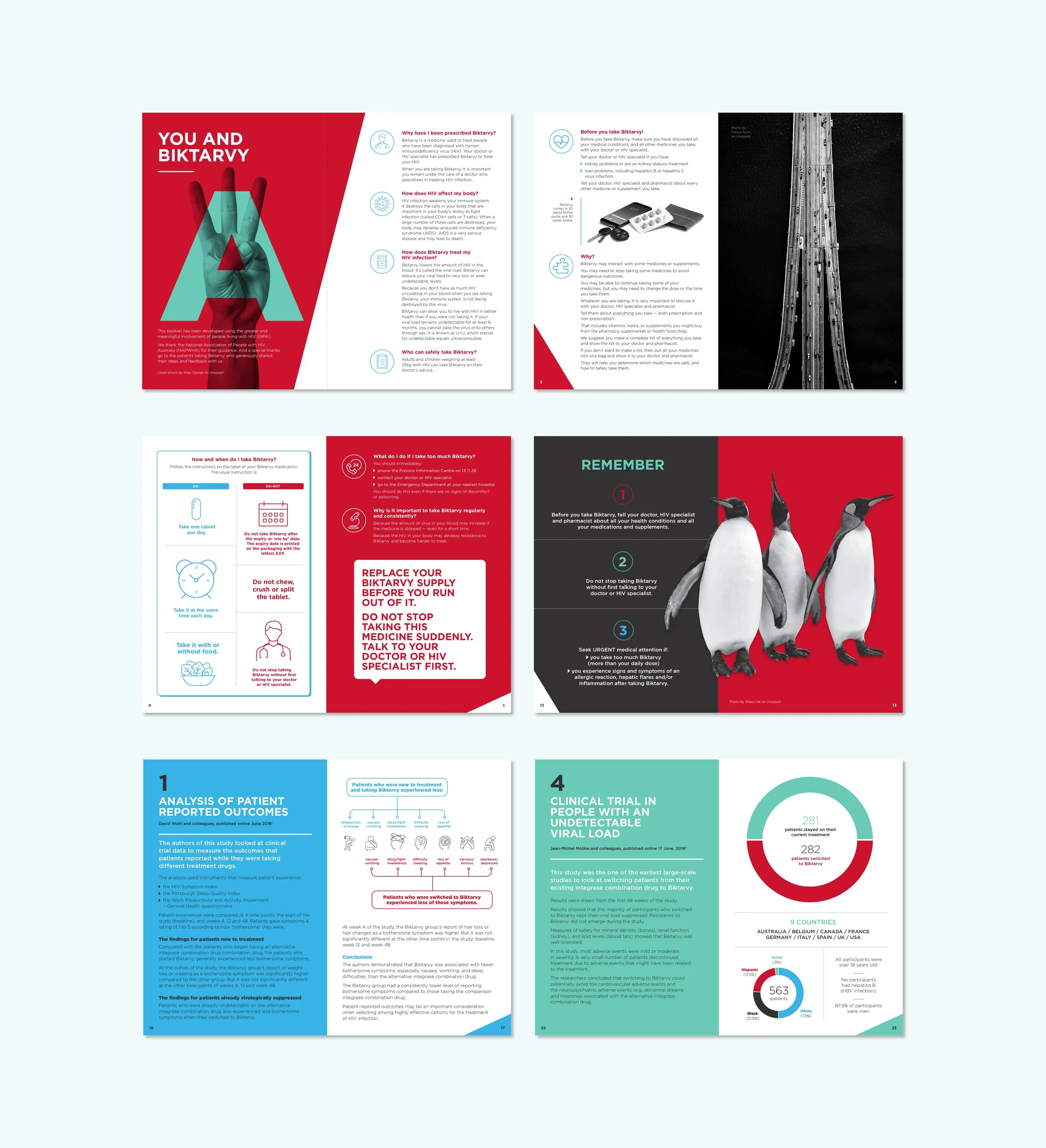
A key feature of the booklet was breaking down complex clinical studies into digestible visual elements. By illustrating the science behind the medication, we empowered patients with a deeper understanding of their treatment.
My challenge was to work within the established Gilead and Biktarvy brand guidelines while introducing a fresh, empathetic aesthetic. The result was a design that felt both professional and rooted in lived experience.
This project was a rewarding exercise in using design to bridge the gap between high-level pharmaceutical data and the people who rely on it.
Epclusa patient information booklet
CLIENT
Gilead Sciences
2023
Following the success of the Biktarvy project, Gilead Sciences commissioned me to develop a new patient resource for Epclusa, a treatment for Hepatitis C. This project aimed to translate clinical information into an accessible, empowering guide that resonated with a diverse audience.
A Community-Led Design Process
A core pillar of this project was a national consultation process involving people with lived experience from across Australia. The consensus was clear: existing collateral was perceived as too clinical and failed to reflect the reality of the community.
I utilised the geometric form of the Epclusa logo as a recurring visual motif. This resulted in a bold, clean aesthetic that focused entirely on clarity and the effective communication of vital health data.
We worked closely with the community to refine the language, ensuring it was accessible to individuals from diverse backgrounds and varying levels of health literacy. The goal was to remove barriers to understanding treatment.
A critical target demographic for this resource includes individuals within the correctional system. This required a specific technical adaptation: the booklet was produced with a stitched-spine binding, as staples are prohibited within many correctional facilities for safety and security reasons.
